What Is Cumulative Layout Shift (CLS)?
Cumulative Layout Shift (CLS) measures the visual stability of your webpage’s content as a user views it. This metric takes into account unexpected movement of elements in the viewport as the page loads.
These kinds of layout shifts can frustrate users because they occur without warning. Making for a poor user experience.
For example, imagine you’re looking to buy new shoes, so you visit a product page for a pair you like. The page begins to load, and you know you want the pair so you go to click or tap the buy button.
But then an ad loads at the top of the screen, and the buy button shifts down. Just as you were about to click it. So you end up clicking on the ad instead.
That’s an unexpected layout shift.
CLS is only concerned with unexpected layout shifts above the fold. Layout shifts that happen outside of the viewport are not factored into your CLS score.
Cumulative Layout Shift is one of Google’s Core Web Vitals (CWVs). These are metrics Google uses to measure your website’s user experience.
Besides CLS, there are two other Core Web Vitals:
- Largest Contentful Paint (LCP): Measures your page’s perceived load speed
- Interaction to Next Paint (INP): Assesses how responsive your page is
Core Web Vitals are page experience signals that can affect your rankings. So, adhering to Google’s recommendations in line with good CWV scores can lead to better performance in search results.
For CLS specifically, that generally involves limiting the number and extent of shifts of different elements on the page.
How to Measure Cumulative Layout Shift
There are a few ways to measure your Cumulative Layout Shift score:
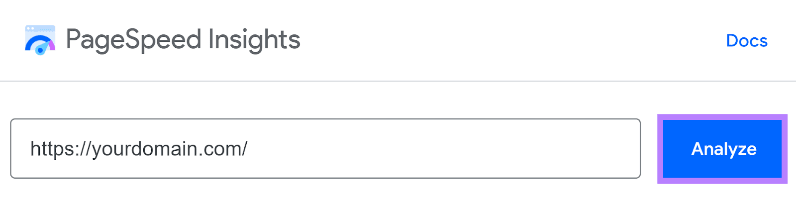
Google’s PageSpeed Insights
PageSpeed Insights analyzes your website’s CLS on both mobile and desktop.
To find your score, simply input your website’s URL (or a specific page you want to test) in the tool and click the “Analyze” button.
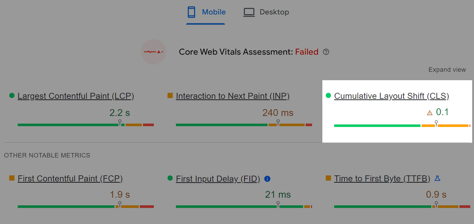
You’ll see a report of your CLS performance and other Core Web Vitals.
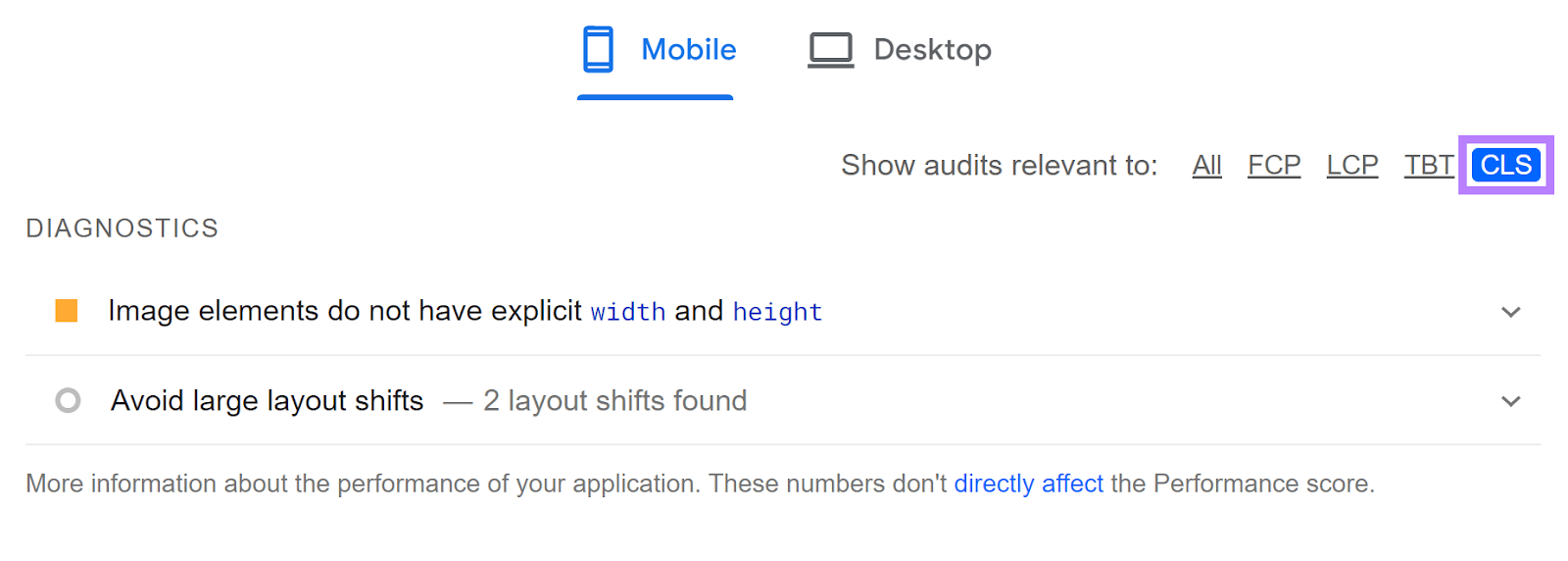
Scroll down to the “Diagnostics” section and select the “CLS” filter to see recommendations specifically regarding Cumulative Layout Shift.
Note that PageSpeed Insights can only analyze one page at a time.
You can also use Lighthouse within Chrome’s DevTools. Bear in mind that this data may provide slightly different results. But you can access it without leaving the page you’re looking to analyze.
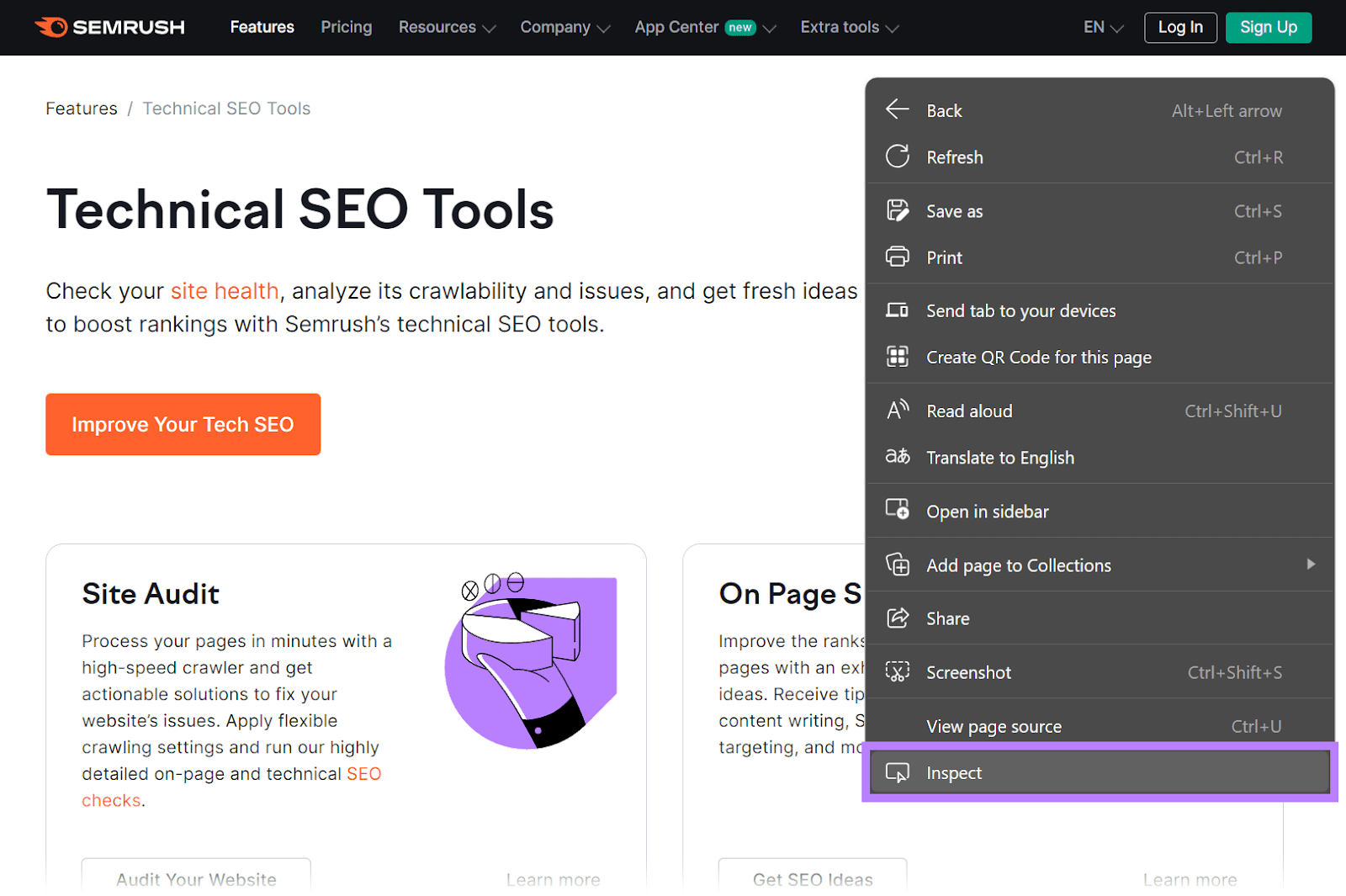
Just right click anywhere on the page and select “Inspect” (or use Ctrl+Shift+I on Windows, or Cmd+Option+I on Mac).
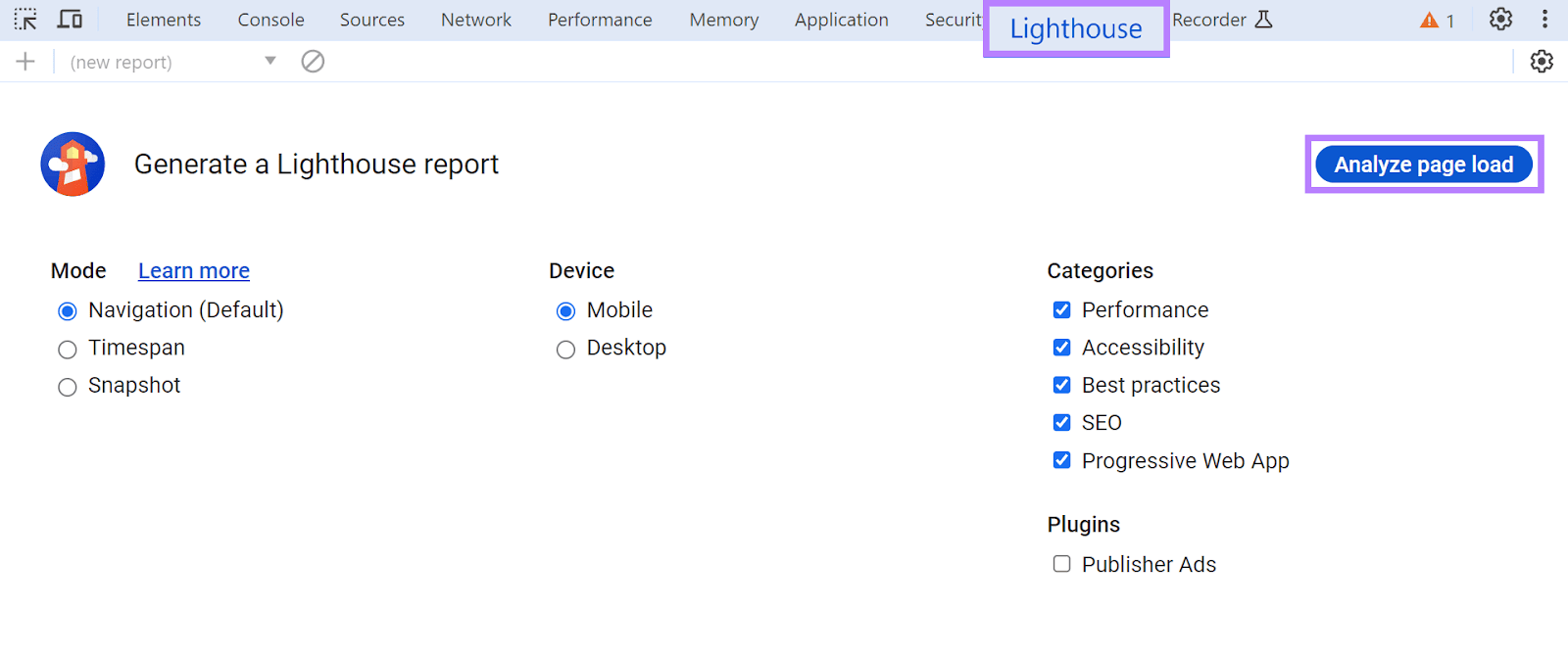
In the window that appears, click the “Lighthouse” tab. Change any relevant settings and click “Analyze page load.”
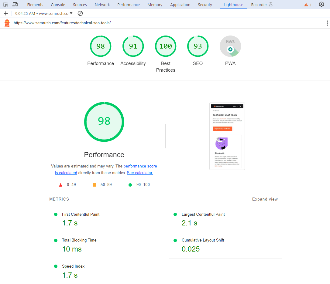
You’ll then see a similar set of results as you would in PageSpeed Insights.
As with the PageSpeed Insights tool, you can only use Lighthouse to analyze one page at a time.
Semrush’s Site Audit Tool
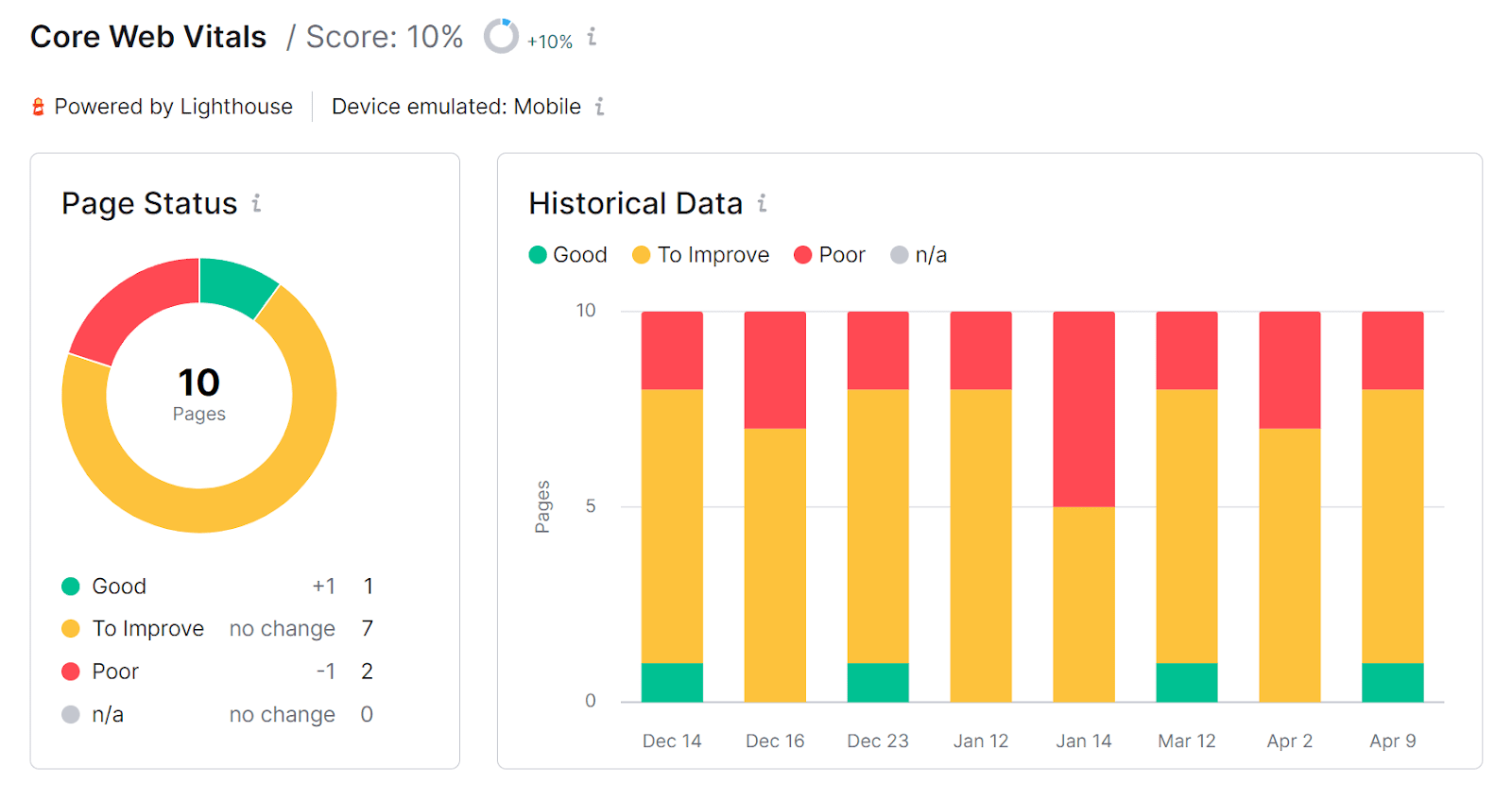
Semrush’s Site Audit tool lets you check your Cumulative Layout Shift score for multiple website pages at once.
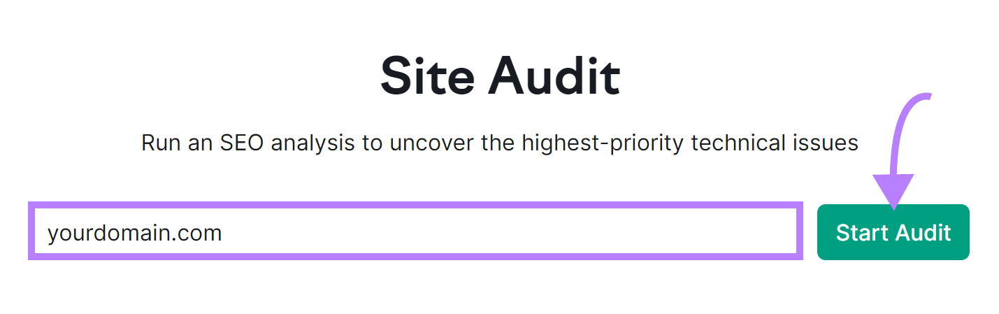
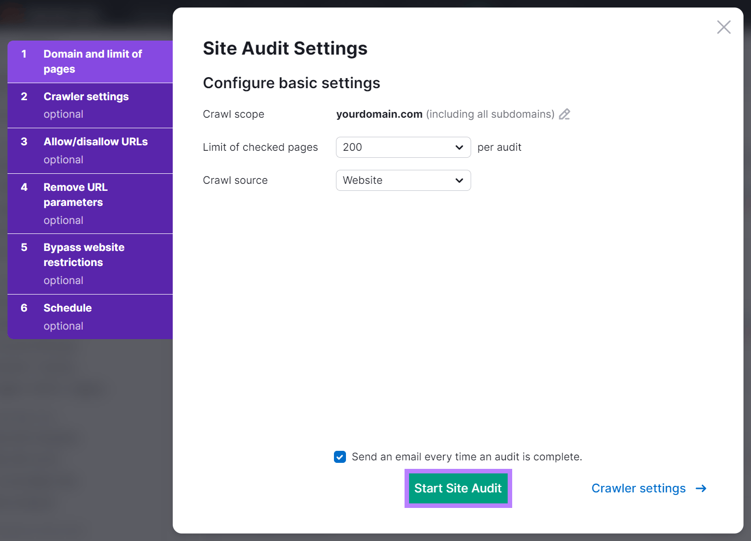
Simply enter your domain name, and click the “Start Audit” button.
Then, configure the tool’s settings according to your preferences. And click on “Start Site Audit” to generate your report.
In the “Thematic Reports” widget, click “View details” under “Core Web Vitals.”
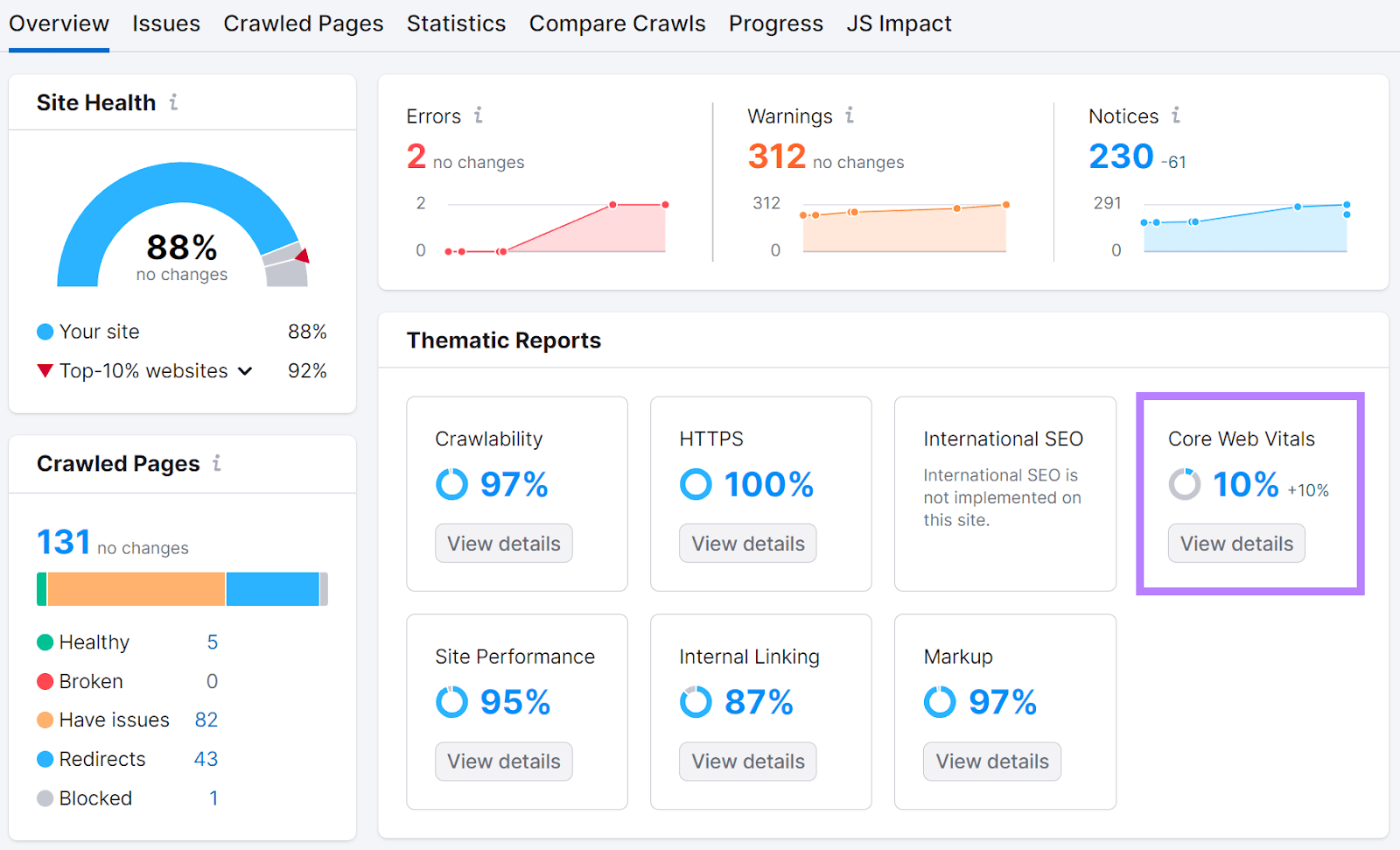
Scroll down to see an overview of your Cumulative Layout Shift scores.
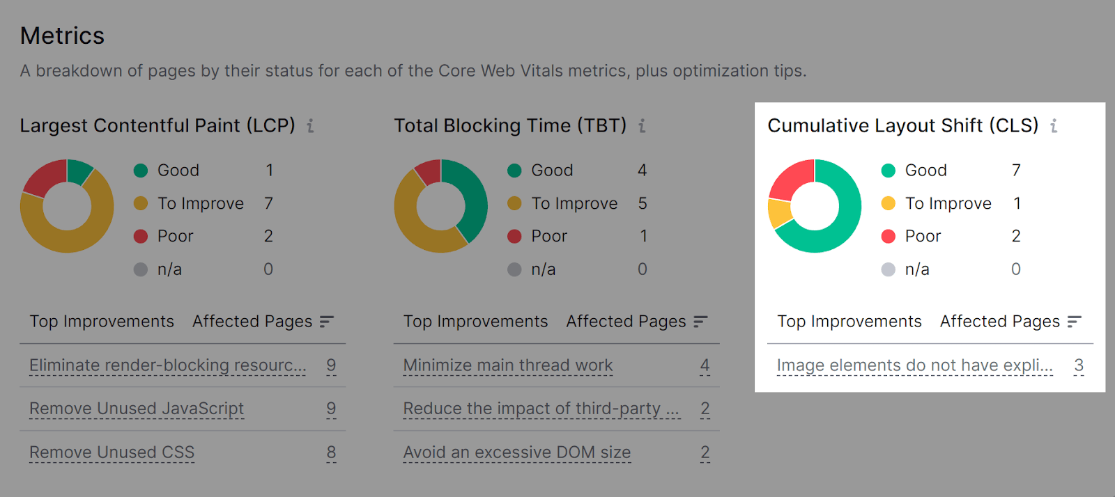
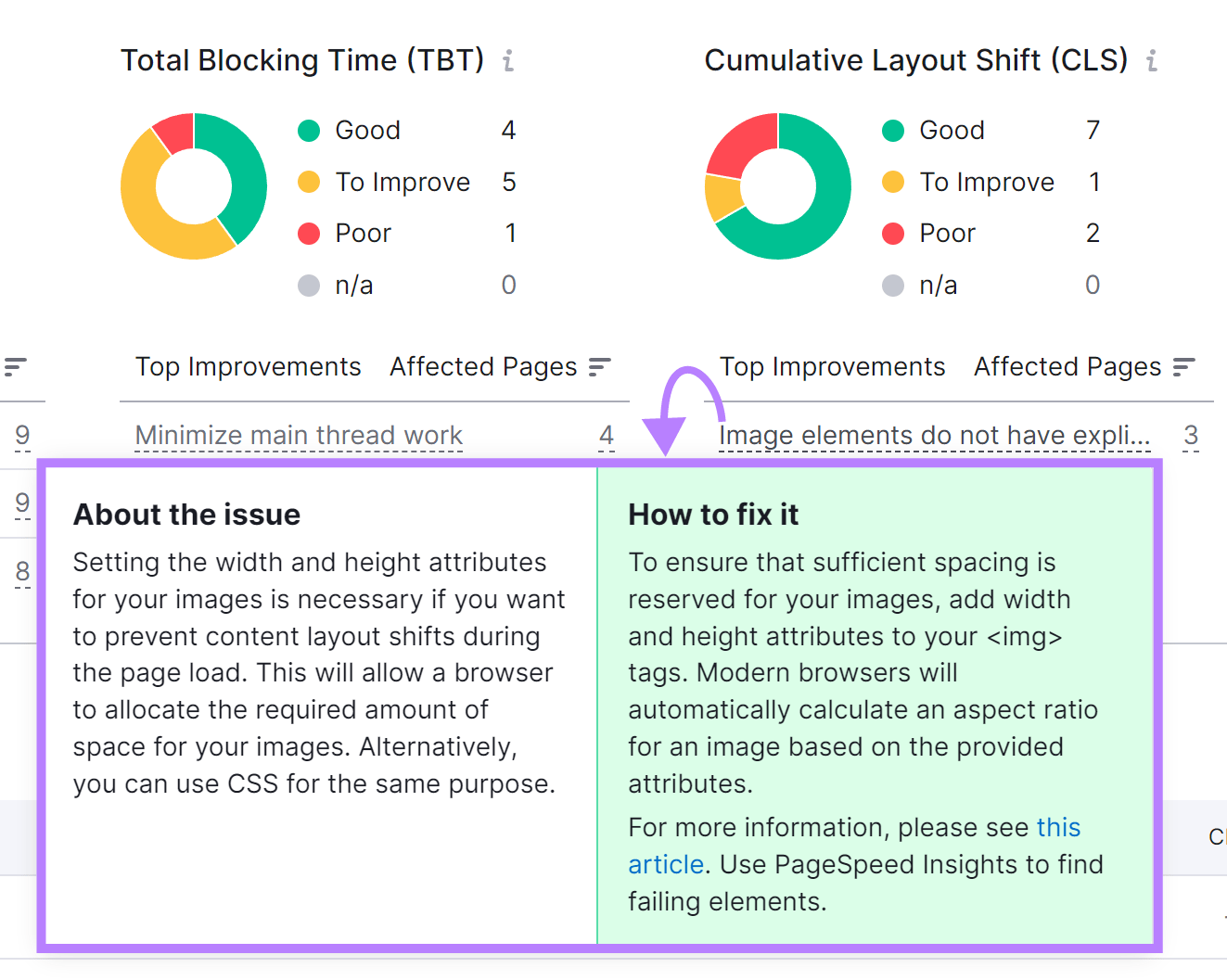
Click on an issue under the “Top Improvements” area to get more information and recommendations. The tool also shows the number of pages each issue affects.
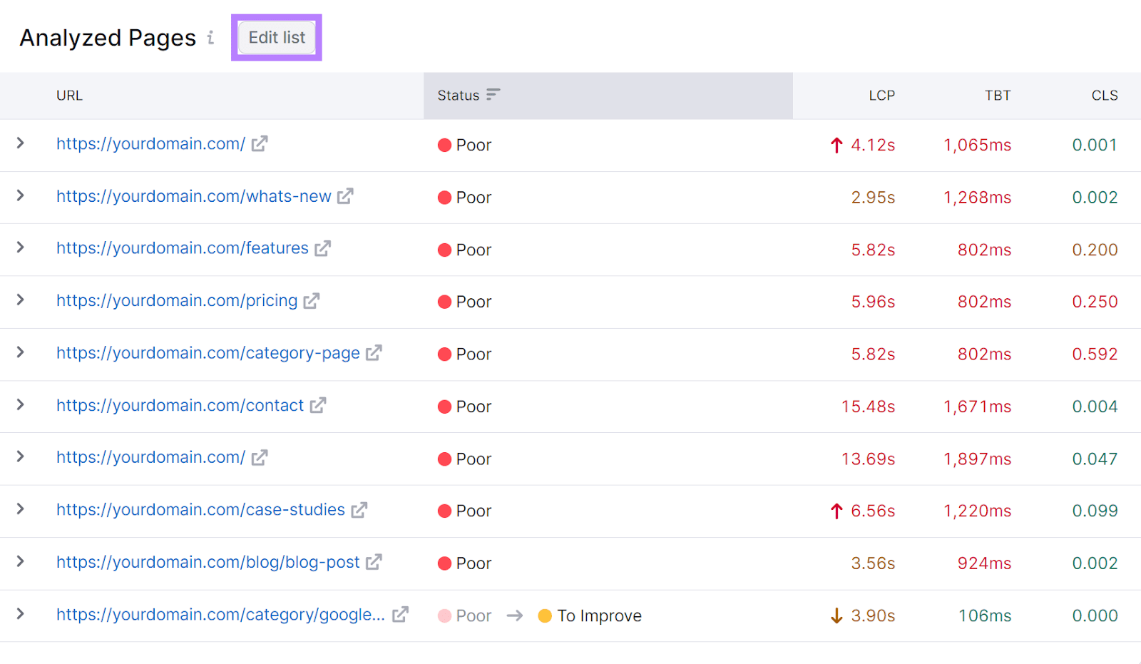
Scroll down to the “Analyzed Pages” table to see which pages Site Audit analyzed for your Core Web Vitals. Click “Edit list” and add up to 10 pages you want to analyze.
The changes will come into effect when you run the audit again.
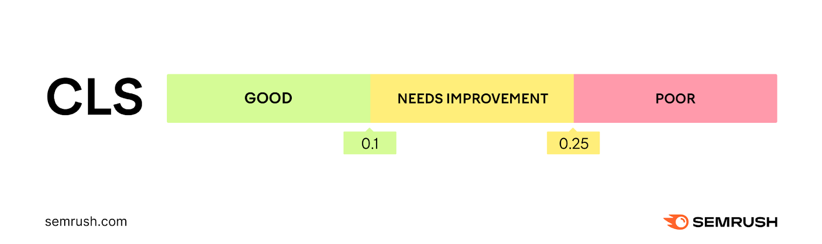
What Is a Good CLS Score?
A good CLS score is 0.1 or lower. This means your layout remains stable as it loads. So, visitors can easily read, click, and interact with your content without unexpected shifts disrupting their experience.
Here’s the performance scale:
Your Cumulative Layout Shift score is a measure of the largest burst of layout shift scores for unexpected layout shifts as your page loads. And layout shift shift scores are made up of two components:
- Impact fraction
- Distance fraction
Where:
Layout shift score = impact fraction x distance fraction
This means that the larger the elements that shift and the further they shift, the higher your CLS score will be. Likewise, lots of layout shifts of any magnitude that occur in quick succession will lead to higher CLS scores.
Common Issues That Cause a Poor CLS Score
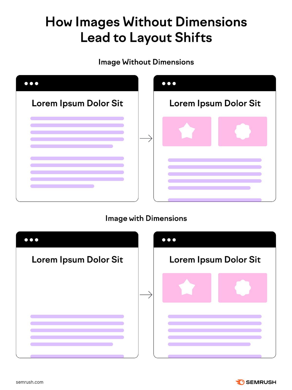
Images Without Dimensions
When you add images to your webpage without specifying their width and height, the browser doesn’t know how much space to allocate until they finish loading. This can cause other elements on the page to shift unexpectedly.
Imagine you click on a link to a blog post. The title and text load in, and just as you start reading, all the text shifts down because a large image loads below the title but above the body text. This is an unexpected layout shift due to the creator not specifying image dimensions.
Ads, Embeds, and iFrames Without Dimensions
Ads, embeds, and iframes without set dimensions can also cause layout shifts. These elements can push content around as they load, leading to a poor user experience.
This is common with third-party ads in particular. As you may have limited control over the sizes of ads your network inserts into your content.
Dynamically Injected Content
When you dynamically add content (like a banner of related posts or a form widget) to a page without first relying on user interaction, you can cause unexpected layout shifts.
Dynamically added content can include:
- Images or videos that load in response to user actions
- Banners that appear after a certain amount of time on the page
- Ads that appear as you scroll
- Social media feeds that load more posts automatically
- Comment sections that expand
When dynamically injected content appears in a way that pushes other elements around on the page, it results in unexpected layout shifts. Affecting your CLS score.
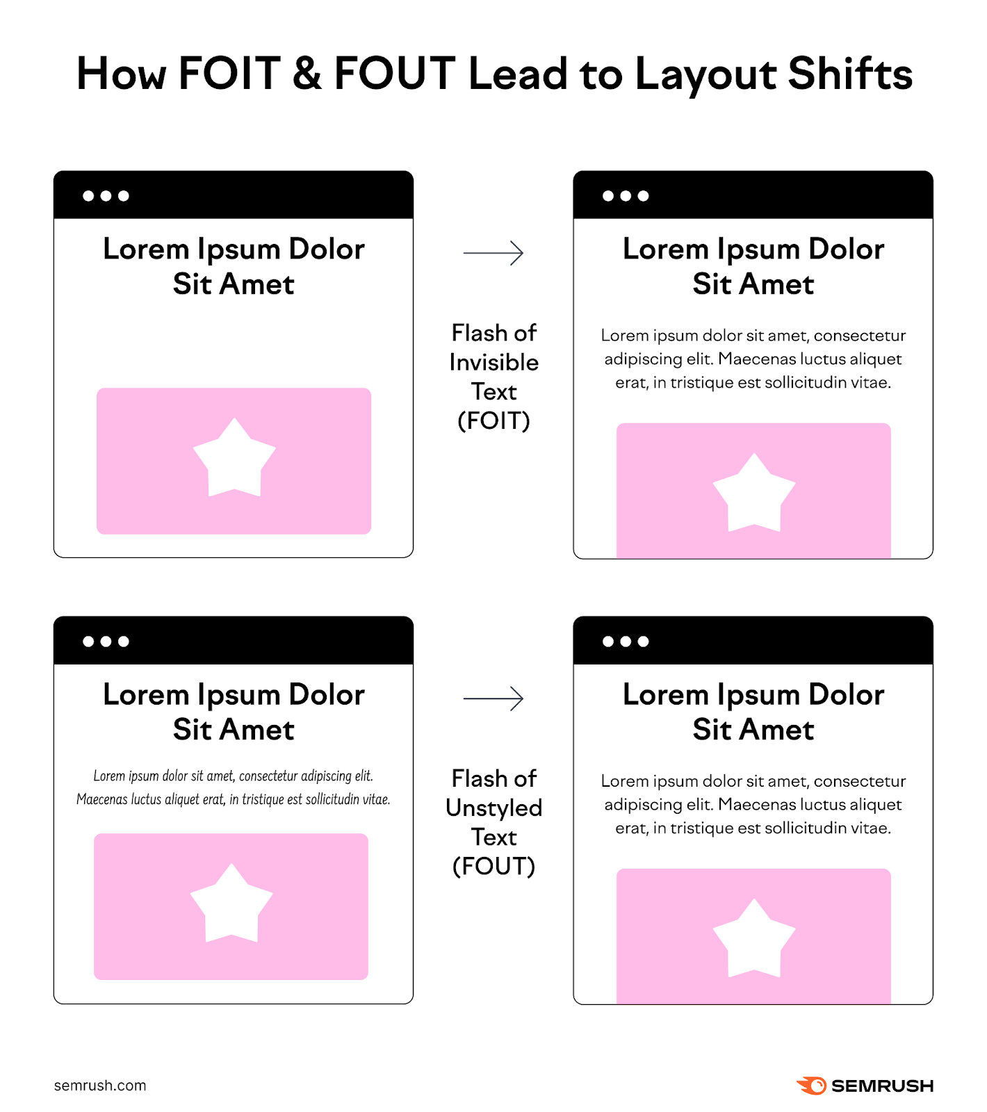
Web Fonts Causing FOIT/FOUT
Flash of Invisible Text (FOIT) and Flash of Unstyled Text (FOUT) can occur when custom web fonts load. With FOIT, the text is invisible until the main font loads. But the space taken up is based on the fallback font (which may be styled differently to the font you want to show), meaning the layout can shift.
While FOUT shows text in a fallback font and then switches to the web font once it loads. If the two fonts are sufficiently different in style, it can affect the layout of other elements.
Improperly Implemented Animations
Certain CSS properties can lead to unexpected layout shifts if you don’t use them correctly. Typically, these are properties like “box-shadow” and “box-sizing,” along with “top” and “left.”
Some properties can trigger a re-layout of a page. While others can lead to layout shifts even if the element that shifts is on its own layer.
How to Improve Your Cumulative Layout Shift Score
Improving your CLS score can provide users with a better experience. And it could influence your rankings too. Here are a few ways to do this:
Specify Image Dimensions
Always set width and height attributes for your images, video embeds, and other media. This tells the browser how much space to reserve for these elements.
Defining these dimensions lets the browser allocate space in the document layout before the image or video fully loads. Minimizing unexpected layout shifts.
Let’s say you add a website banner for desktop users. If the banner’s image dimensions are 1200 x 400 pixels, add the code below to your website HTML code:
<img src="banner.jpg" width="1200" height="400" alt="Example banner image.">
Use CSS Aspect Ratio Boxes
Implement aspect ratio boxes in your CSS to maintain the same width-to-height ratio regardless of screen size. This ensures your content scales without layout shifts. Ideal for mobile responsiveness.
Aspect ratio boxes work by creating a container with a predefined size ratio. This prevents the content from expanding or contracting in a way that could shift other page elements.
To create a responsive aspect ratio box for a video, you could use something like this:
.video-container {
position: relative;
padding-bottom: 56.25%;
height: 0;
}
.video-container iframe {
position: absolute;
top: 0;
left: 0;
width: 100%;
height: 100%;
}
The above code keeps your video in a designated area of your webpage and maintains its proper shape. It won’t shift or cause layout changes as your page loads.
A more modern approach (on modern browsers that support it) would be something like this:
.video-container {
aspect-ratio: 16 / 9;
width: 100%;
}
.video-container iframe {
width: 100%;
height: 100%;
}
Reserve Space for Dynamic Content
Anticipate and reserve space for dynamic content like ads to prevent them from pushing content around when they load. When the dynamic content loads, it fits into the allocated space without affecting the layout of other page elements.
For example, if you plan to display an ad at the top of an article, include a placeholder the same size as the ad.
Add a div element where you want the ad to appear in your article. Give this div an ID or class you can refer to in your CSS. Like this:
<div id="ad-placeholder"></div>
Place this div at the top of your article where the ad will load.
Use CSS properties to specify the dimensions of this placeholder. Ensure these dimensions match the ad size that will load in this space. For example, if the ad is 728 x 90 pixels, add the following CSS code:
#ad-placeholder {
width: 728px;
height: 90px;
background-color: #f0f0f0;
}
The above CSS code will make the placeholder div occupy the amount of space intended for the ad before it loads. The background color is a visual cue to notify the user that something will appear there.
To make it responsive, use percentages for width and maintain the aspect ratio with padding. Typically, ads have fixed sizes depending on the device.
Use media queries to adjust the placeholder’s size based on the screen size. This way, your placeholder adapts to various screen sizes but remains ready for a specific ad size when viewed on larger screens.
#ad-placeholder {
width: 100%;
height: 0;
padding-bottom: 12.5%;
background-color: #f0f0f0;
}
@media (min-width: 768px) {
#ad-placeholder {
width: 728px;
height: 90px;
padding-bottom: 0;
}
}
Avoid Adding New Content Above Existing Content
Adding content above what’s currently on the screen can push everything down, disrupting the user’s reading or browsing flow.
Instead of dynamically inserting a promotional banner at the top of a page the user is viewing, consider adding it to a section the user hasn’t scrolled to yet. Or, insert it after a user action, like clicking a button.
Handle Fonts Properly to Prevent FOIT/FOUT
Minimize the impact of web fonts by preloading essential fonts and using the font-display CSS feature to control how and when fonts display.
Preload fonts and set font-display to “optional” to reduce the likelihood of text being invisible (FOIT) or abruptly changing style (FOUT). The “optional” display attribute lets the browser choose to use a fallback font if your main font takes too long to load.
To preload critical web fonts, use a line of code like this:
<link rel="preload" href="https://example.com/fonts/mywebfont.woff2" as="font" type="font/woff2" crossorigin>
Use the following in your CSS to ensure the text remains visible during font loading and prevent layout shifts:
@font-face {
font-family: 'MyWebFont';
src: url('/mywebfont.woff2') format('woff2');
font-display: optional;
}
Use the Transform CSS Property for Animations
Finally, if you find animations are leading to poor CLS scores, consider using the “transform” CSS property. This lets you animate elements on the page without leading to unexpected layout shifts.
As with adding image dimensions, this is something your website builder might do for you. But if not, you can use “transform: scale()” instead of changing the height and width properties.
And you can move elements around with “transform: translate(). Rather than changing the top, right, bottom, or left properties.
Improve Your CLS Score with Semrush
Semrush’s Site Audit tool identifies your website’s CLS issues and provides tailored advice to improve your Cumulative Layout Shift score. And it does the same for other Core Web Vitals too.
Plus, running subsequent audits at regular intervals allows you to monitor improvements over time.
Try Site Audit today to access a comprehensive performance report with over 140 on-page and technical SEO checks.
This post was updated in 2024. Excerpts from the original article by Luke Harsel may remain.
